
In a world saturated with visual noise, constant notifications, and complex imagery, minimalist art and design stand out through restraint. By reducing elements to their essentials—form, space, color, and intention—simple designs often deliver clearer, more memorable, and emotionally resonant experiences. This approach, rooted in mid-20th-century art movements, continues to evolve across fine art, graphic design, interiors, and digital interfaces, proving that less can indeed create greater impact.
The Roots of Minimalism in Art
Minimalism emerged in the early 1960s primarily in the United States as a deliberate reaction against the emotional intensity and gestural excess of Abstract Expressionism. Artists sought to strip away narrative, symbolism, and personal expression, focusing instead on pure form, material, and the viewer’s direct encounter with the work. Key figures included Donald Judd, whose stacked boxes and modular units emphasized industrial materials and spatial relationships; Agnes Martin, known for quiet grids and subtle bands that invited contemplation; Carl Andre, who arranged bricks or metal plates directly on the floor to challenge traditional display hierarchies; Frank Stella, whose early shaped canvases and Black Paintings treated the painting as an object rather than an illusion; and Dan Flavin, who used fluorescent light tubes to define space through illumination.
Central principles defined the movement: geometric simplicity (squares, rectangles, lines, and cubes), material honesty (steel, plywood, fluorescent tubes, or bricks presented as themselves), repetition and seriality, and the deliberate use of negative space. Negative space was never empty; it allowed forms to breathe, guided the eye, and made every placement intentional. As one foundational idea put it, the quality of the whole object mattered more than accumulations of details. The result was art that felt calm, deliberate, and focused—inviting slower, more attentive looking rather than quick narrative consumption.
Why Simple Designs Feel More Powerful
The strength of minimalism lies partly in human perception and psychology. The brain prefers order and processes clear, uncluttered stimuli more fluently. Research on processing fluency shows that stimuli easier to parse are often rated as more attractive, pleasant, and trustworthy. Complex visuals increase cognitive load—the mental effort required to filter signal from noise—while simplified compositions reduce extraneous demands, freeing attention for what remains.
Viewers form aesthetic judgments rapidly, often within about 50 milliseconds. Clean layouts with limited elements consistently outperform cluttered ones in perceived beauty and reliability. Negative space creates visual hierarchy and breathing room, directing focus without competition. Limited color palettes and purposeful typography further enhance clarity. In practical terms, this translates to designs that feel calm and controlled amid everyday chaos, reducing visual fatigue and supporting better engagement or decision-making.
Minimalist approaches also encourage deeper interaction. With fewer distractions, subtle qualities—precise edges, material texture, proportional relationships, or the interplay of light and form—become more noticeable. The work does not shout; it invites the viewer to complete the experience through attention.
Contemporary Minimalist Trends and Evolutions
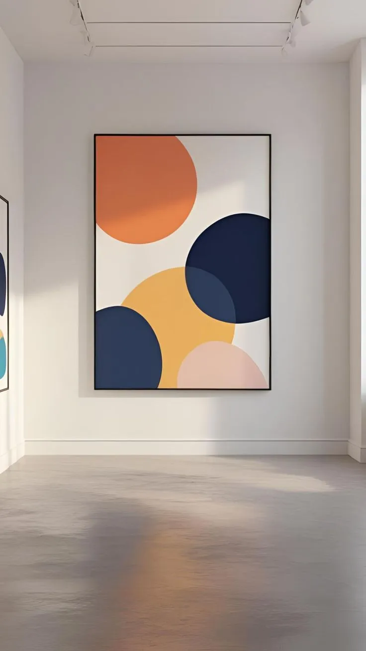
Minimalism has never been static. While classic versions emphasized stark neutrality and industrial coolness, recent years show a shift toward warmer, more expressive interpretations often described as organic minimalism, bold minimalism, or neo-minimalism. Cold, sterile white-and-gray schemes are giving way to complex neutrals—creams, mushrooms, terracottas, olives, and soft earth tones—paired with natural materials such as wood, stone, linen, plaster, and ceramics. Texture and subtle tactility add depth without clutter.
In graphic and digital design, trends include strategic bold color accents against restrained backgrounds, oversized or confident typography that functions as both message and visual element, and creative use of negative space for hierarchy and calm. Web and interface design benefits particularly: fewer heavy elements improve loading speed, mobile adaptability, and crawlability for search engines. Simplified layouts with one clear primary action have demonstrated higher conversion rates in tested scenarios compared with multi-element, competing-call-to-action pages.
In interiors and product design, the emphasis moves from emptiness to intentional selection—fewer objects of higher quality and better materiality. Multifunctional furniture, soft curves alongside clean lines, and layered lighting help spaces feel inviting rather than austere. Fine art continues the tradition through monochromatic surfaces, geometric abstraction, and explorations of light, perception, and material, while newer practitioners introduce organic or process-based variations that retain reductionist discipline.
Across branding, the same principles appear in memorable, adaptable identities that prioritize clarity and longevity over decorative trends. Companies known for sleek product and visual systems illustrate how restraint can convey sophistication, reliability, and focus.
Practical Principles for Creating Impactful Minimal Designs
Successful minimalism rests on intention rather than mere subtraction. Every element must earn its place by serving form, function, or focus. Composition becomes critical: balance, proportion, symmetry or deliberate asymmetry, and the rule of thirds help structure sparse arrangements. Negative space is actively designed—it frames, separates, and establishes hierarchy.
Color is handled sparingly, whether through neutrals for serenity or selective vibrant accents for emphasis. Typography favors legibility and personality without excess styles. Materials and textures provide sensory interest when visual complexity is reduced. In digital contexts, progressive disclosure—revealing detail only as needed—keeps interfaces approachable while supporting deeper use.
The goal is not austerity for its own sake but clarity that amplifies meaning. When executed well, the remaining elements gain intensity and presence. Viewers experience the work or design as a coherent whole rather than a collection of competing parts.
Enduring Relevance in a Complex World
Minimalist art and design persist because they address contemporary needs. In environments overloaded with information, simplicity offers cognitive relief and emotional calm. It supports faster comprehension, stronger first impressions, and more memorable communication. At the same time, evolving forms—warmer palettes, tactile materials, assertive yet restrained expressions—prevent the approach from becoming rigid or dated.
The power of simple designs does not come from emptiness. It comes from rigorous selection, precise relationships between form and space, and respect for the viewer’s attention. By focusing on essentials, minimalist approaches create visual experiences that feel purposeful, serene, and enduring. Whether encountered in a gallery, a digital interface, a living space, or a brand identity, well-crafted simplicity continues to demonstrate that reduction, when guided by intention, can produce the strongest impact.
Read more – Marathidailyquotes.com
